Accordion
The Accordion module lets you present a variety of content by expanding and collapsing the text, saving space while maintaining a professional appearance.
Usage
An accordion is great for whenever you have a list of items with details that you don't want to clutter the main page with but want the information easily accessible. Here are some good uses for the Accordion module:
- FAQs
- Q&A
- Feature Lists
Items tab
In the Items section, you can add, edit, and remove accordion content items.
Custom Content
The Custom Content source option allows you to add your own content using the bio classic editor.
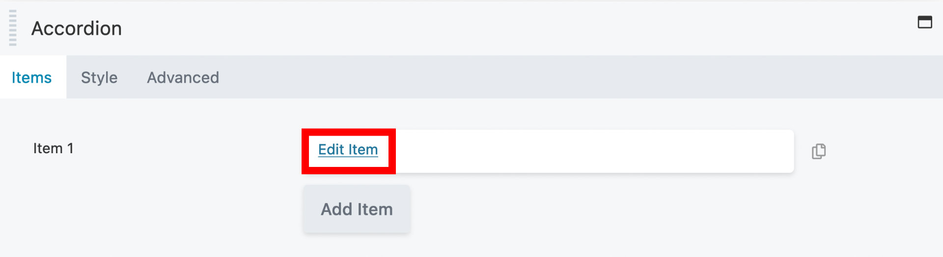
Edit items
When you first add an Accordion module to your layout, a blank item will be created for you to edit. To edit an item, click the Edit Items link.
Add items
To add more accordion items, click the Add Item button.
Label
Enter a name for your accordion item. This appears in the Accordion module settings panel to identify the item and on the frontend.
Display
The Display section contains the following options:
- Collapse inactive
By default set to Yes, which allows only one item to be expanded at a time. Change to No to allow more than one item to be expanded,
- Expand first item
By default set to No. If set to Yes, the first item will be expanded on the first view, before the user clicks to expand anything.
Style tab
In the Style tab, you can change the color of the accordion items, such as the text and icon color, the border color, and more.
Item
- Item Size
Changes the Accordion item size with specific padding values.
- Small - Sets the padding to
10px 15px. - Medium - Sets the padding to
15px 20px. - Large - Sets the padding to
20px 25px.
- Small - Sets the padding to
- Item Spacing
Control the spacing between accordion items.
- Item Border
The Border section has settings for border, radius, and shadow.
Label
- Text Color
Set the text color of the Accordion label.
- Background Color
Set a background color for Accordion label.
- Padding
Set a specific padding value in pixels for the accordion label. Click the Link Value icon to automatically make all four padding values the same.
- Typography
Set the font size, family, line-height and more for the Accordion label.
Icon
- Icon Position
Set the position of the accordion expand and collapse icons. The Left option positions the icon before the accordion label.
The default is Right.
- Icon
Choose a custom icon that replaces the default icon.
- Active Icon
Choose a custom icon that replaces the default icon.
Content
- Text Color
Set the text color of the Accordion content.
- Background Color
Set a background color for Accordion content.
- Padding
Set a specific padding value in pixels for the accordion content. Click the Link Value icon to automatically make all four padding values the same.
- Typography
Set the font size, family, line-height and more for the Accordion content.
Advanced
There are all the usual Advanced tab settings for margins, visibility, animations, and advanced HTML settings.