List
While it's easy to add bulleted and numbered lists in a text editor, the List module offers you an easy way to shape them into beautiful designs.
The List module is based on optional headings, content, and list marker icons. If you choose to display list markers, they can be to the right or the left of either the headings or the content.
List group examples
Unordered lists
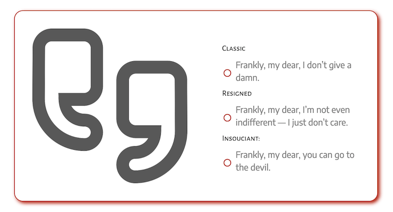
This is the typical bulleted list, but you can choose your list marker and adjust its size. You can choose from the standard circle and square icons that are available as list item markers for standard unordered lists.
The advantage of the List module is that you can style the markers by easily changing the size, adding padding to change their position, and placing them to the right or left of the list.
Here's an example of an unordered list with both headings and content and list markers displayed to the left of headings.

Here's the same list with list markers displayed to the left of the content instead.
Unordered lists are represented by the standard <ul> tag in the HTML output.
Ordered lists
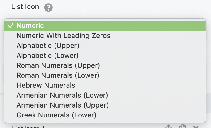
This is the typical numbered list with an <ol> tag in the HTML output, but you can choose from various ordering notations for the list item marker, such as numeric, alphabetic, or Roman, Hebrew, Armenian, or Greek numerals.
Here's an example of an ordered list with just headings and markers, no content.
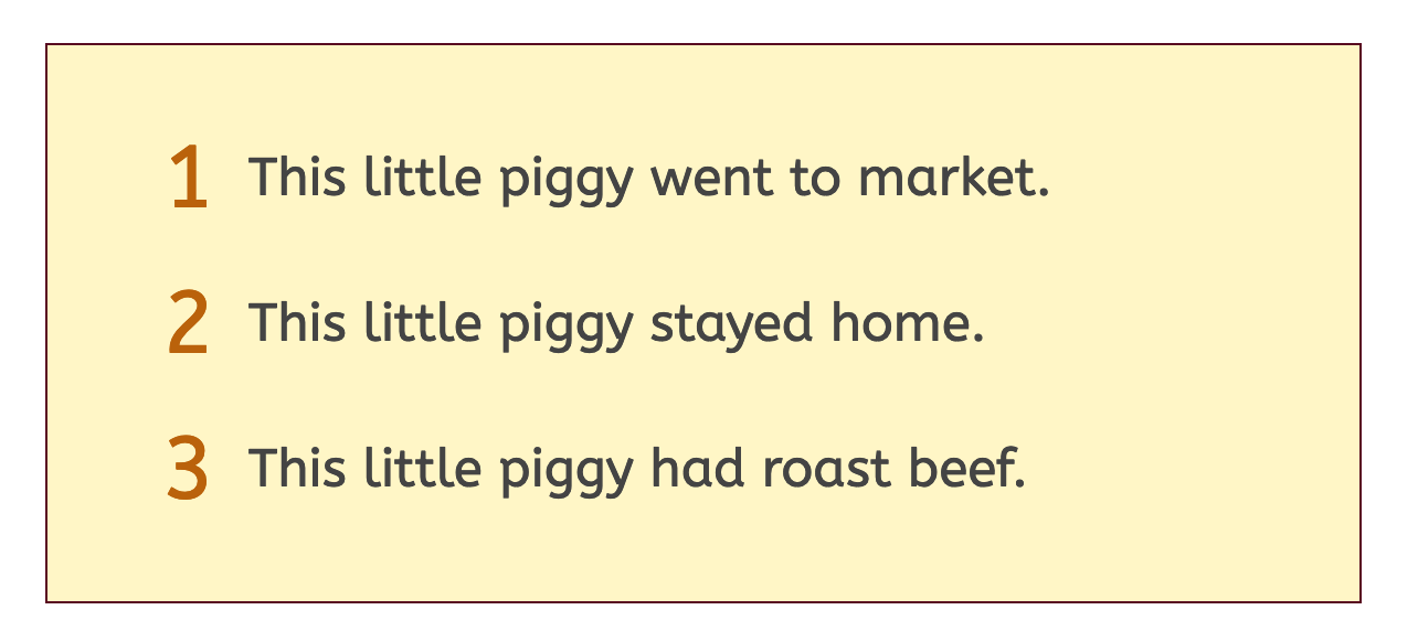
In this example, the icon size was increased. By default, the icon is vertically centered with the heading, but you can change the position by adjusting the icon padding setting.
NOTE
Ordered list item markers do not include a period after the number.
Here's an example with just content and no headings, plus a separator between items.
TIP
There's no setting to increase space between list items, but you can add a CSS rule by creating a custom class name for your List module (we'll call the custom class name my-list-padding ) and then adding the following CSS rule:
.my-list-padding li { padding: 20px 0 20px 0; }
The four padding numbers are for top, right, bottom, and left respectively.
Here's how the output changed with this rule:
Generic
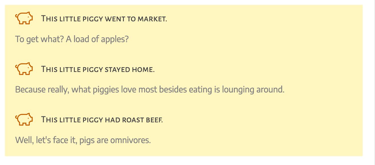
Generic lists let you select from your regular icon set instead of using standard list markers. They are represented by the <div> tag in the HTML output, with the option to choose an icon from your regular icon set as the marker.
Here's an example of a generic list with a Font Awesome icon, set at 30px, and icon padding-right adjusted for more room between the icon and the heading.
Here's another example that shows two List modules, one for the list of advantages and one for the list of disadvantages, both with content and icons but no headings. The arrow icons are from the Font Awesome set and are displayed to the right of the content. The headings for each list are Heading modules.

TIP
When you select markers or icons to the right of the headings or content, they are right-aligned. You can adjust their position by using icon padding.
Here's another example of a Generic-type list with heading, content, and icons, in which the icons are set to the right of the headings.

And here's an example with headings and content but no icons:
See the settings below for more information about how to control the placement and style of the headings, content, and markers of items.
Settings for the entire list
General tab
The General tab contains three sections: List items, Display, and List item tags.
List items section
This is where you add the content and style for individual list items. Click Edit list item to add the first item, after you save click Add list item for additional items.
Display section
- List typeGeneric, Unordered, or Ordered, as described above.
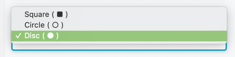
- List iconChose the icon for the list item marker. The choices depend on which type of list you choose, as described in the first section of this article.
- List icon placementChoose where the list item marker will appear. The choices are to the left or the right of the heading or the content. Choosing Right of heading or Right of content places the list item markers flush with the right margin of the list container. You can fine-tune the positioning of the icons by changing the Icon width and Icon padding settings in the Icon style section of the Style tab.
- List iconChose the icon for the list item marker. The choices depend on which type of list you choose, as described in the first section of this article.
List Item Tags section
- List item heading tagChoose the HTML tag that will be used for the list item's heading. You can choose from
<h1>-<h6>or the<span>or<div>tag. - List item content tagChoose the HTML tag that will be used for the list item's content. You can choose the
<div>,<aside>, or<section>tag. If you're not sure, choose the generic<div>tag.
Style tab
Top section
- List background colorPuts a background color around the entire list.
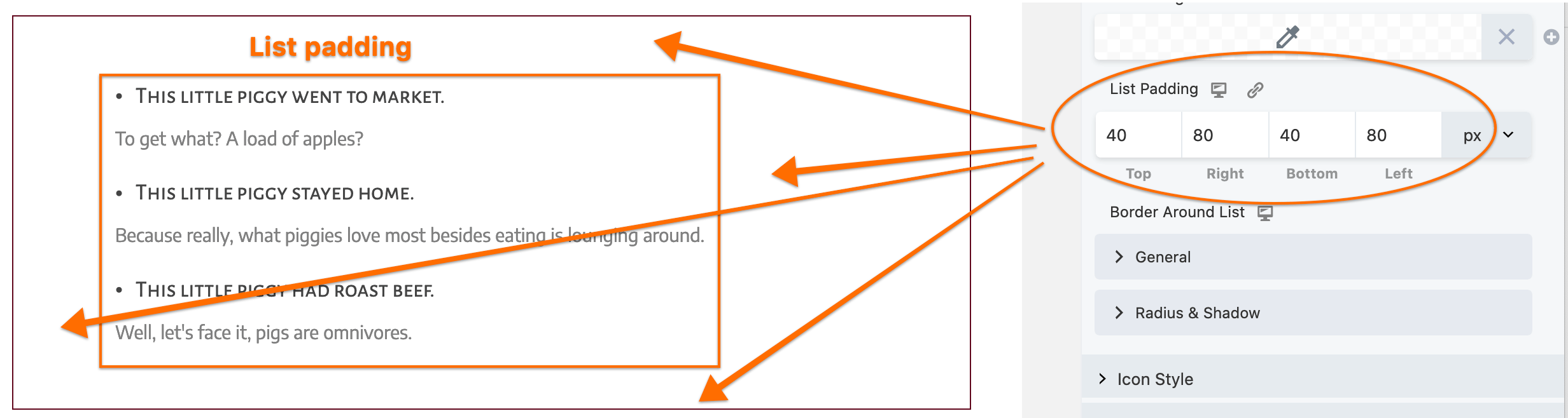
- List padding (responsive)Adds padding between the list border and the list items. This is especially useful when you've set a background color or border, as shown in this screenshot.
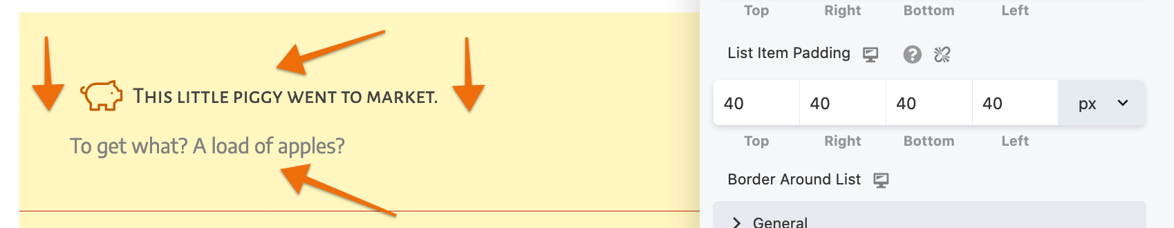
- List item padding (responsive)Adds padding around the list items themselves, as shown in this screenshot. If you want even more control over padding around list items, use the List item padding setting on the Style tab for individual list items.
- Border around list (responsive)Adds a border, radius, or shadow around the list
Icon style section
This section sets style properties for the list item markers selected on the General tab.
- Icon color
- Icon size
Size of the icon, in pixels.
- Icon width
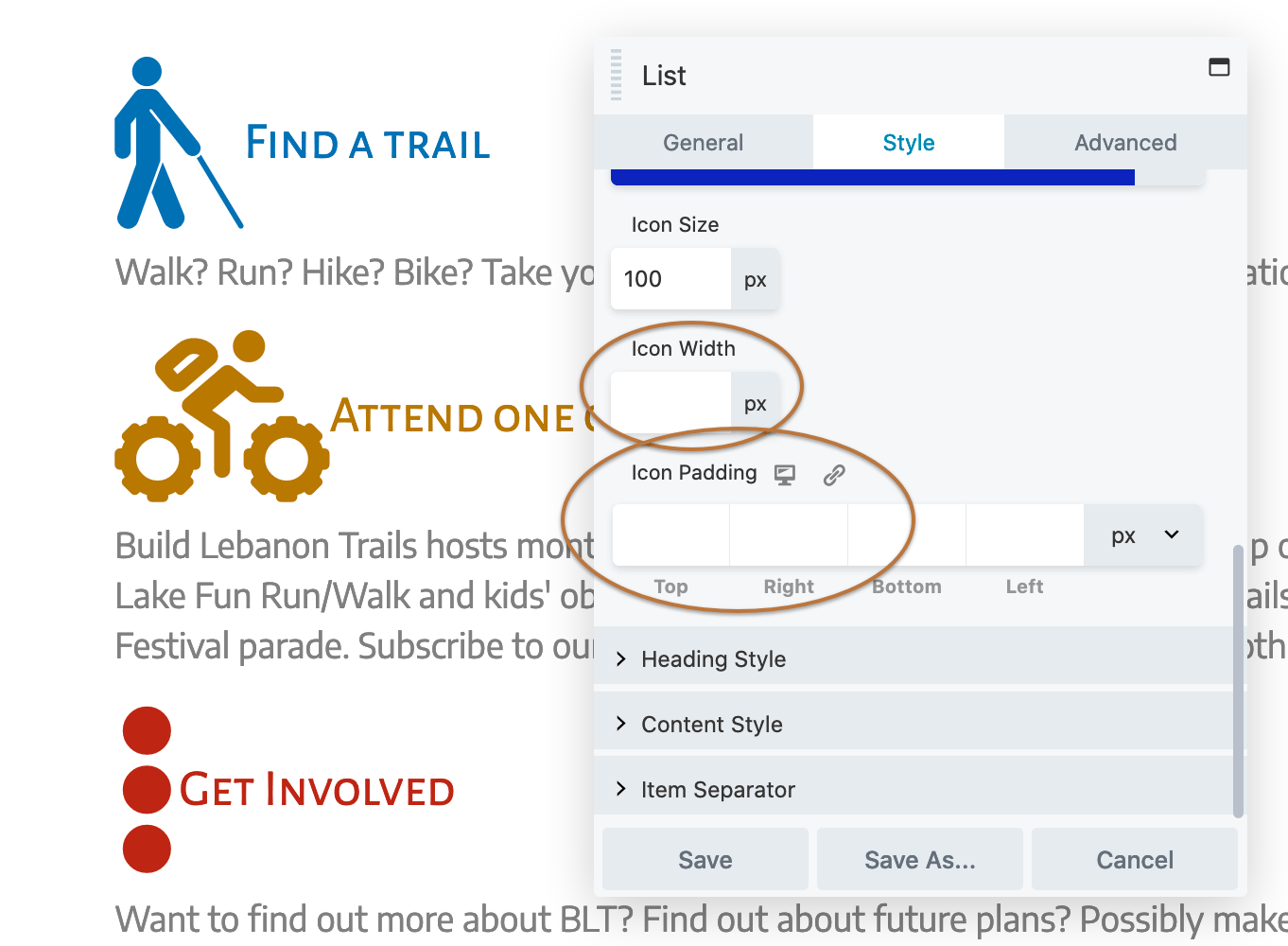
Determines the width of the icon's boundary box. This setting is useful when some icons in your list are wider than others and you want to vertically align them.To achieve vertical alignment, the Icon width setting must be greater than the sum of icon size + icon right padding + icon left padding.Here's a method to adjust Icon width, and Icon padding so the icons are vertically centered but the widest icon is aligned to the left edge of the list.First, here's a list with Icon size set to 100px with no settings for Icon width or Icon padding. You can see that the icons are not vertically centered.
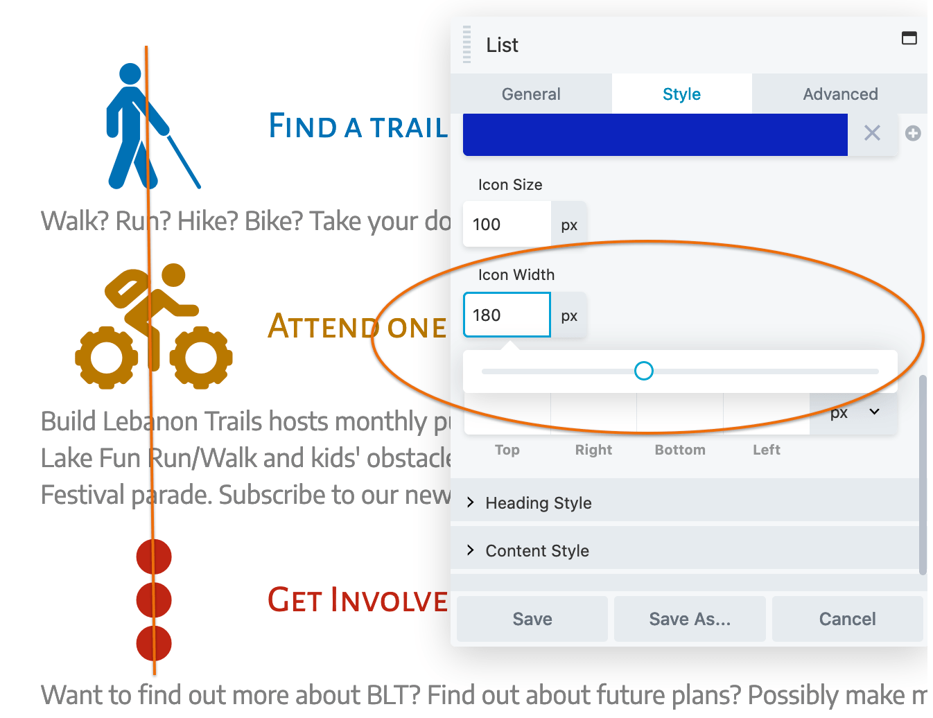
- Click in the Icon width field and use the slider to vertically align the icons and create the distance you want between the icons and the heading text. Because the icon size is 100px, the icon width will have to be at least 100px for the icons to be vertically aligned.
- Click in the Right setting for Icon padding and move the slider to the right until the widest icon is as far to the left as you want it:
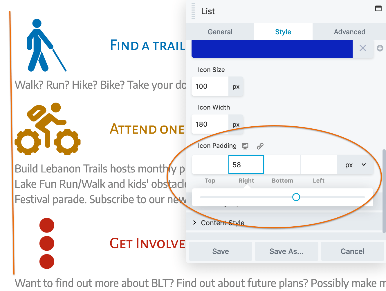
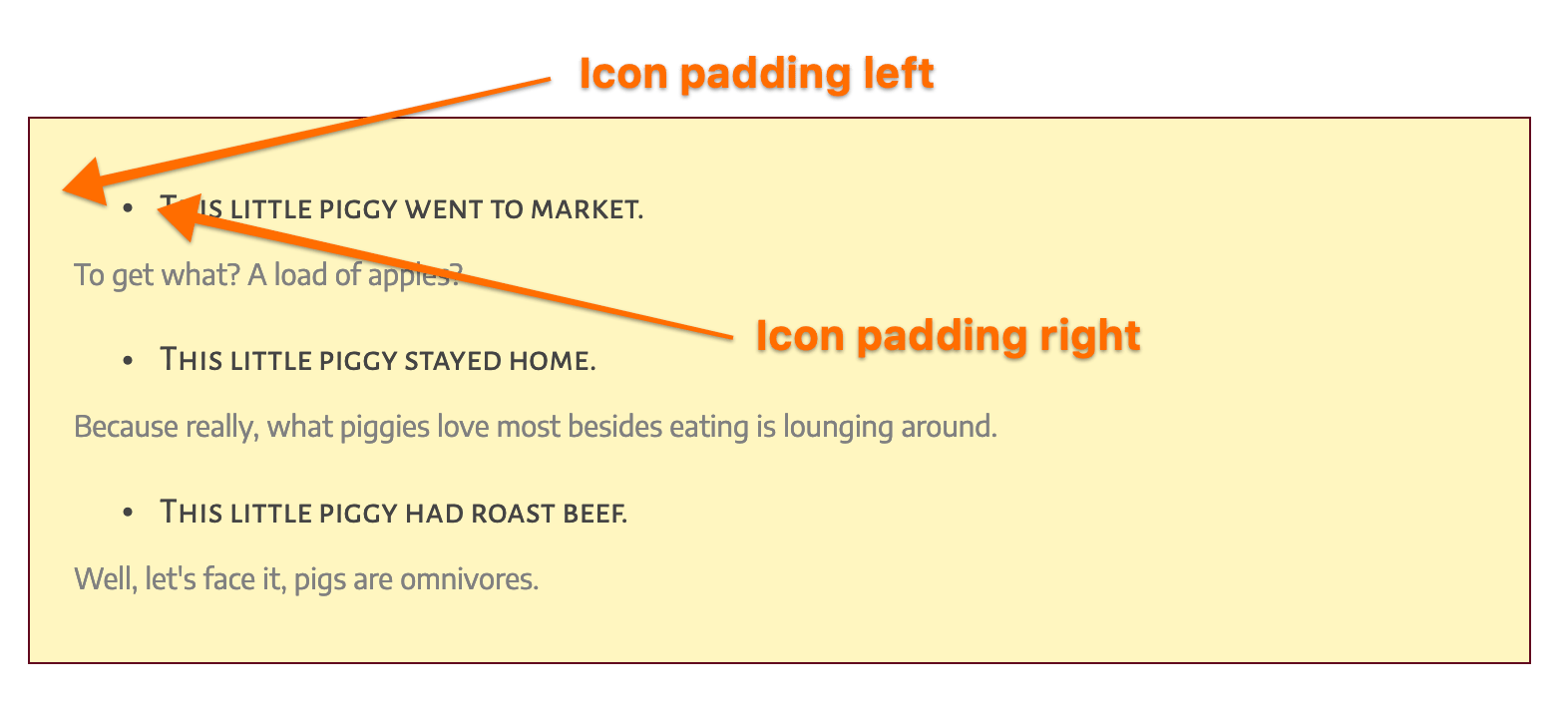
- Icon padding (responsive)Increases padding between the icon and icon's border-box. If you have icons on the left, increasing the left icon padding indents the line and increasing the right icon padding increases the space between the icon and the text, as shown in this screenshot.
- To adjust the vertical position of the icons, tweak the top or bottom padding.
TIP
There's no setting to align the heading with content when there's a list item marker to the left of the heading, like this:

As a workaround, you can use some inline CSS in the text editor to increase the indent for the content.
- For the content text of each list item, go to the Text tab of the text editor and wrap the content with an HTML tag such as
<p>, then add a style attribute and adjust the number of pixels of padding to indent the content to what you want, as in this example:
<p style="padding-left:20px;">This is the content text under the heading, indented by 20px.</p>