Button
The Button module serves as an object that can be inserted into your layout, resembling a physical button.
Module Applications
Traditionally, a web button is an attractive element that functions as a link, redirecting visitors to another location upon clicking.
Moreover, the button has the capability to open a lightbox, which can display various types of content. You can insert content using shortcodes, HTML code, or even an <iframe> code.
Tip: Both the Button module and the Video module can be utilized to play a video within a lightbox. To understand the distinctions between them, refer to the article on opening a video in a lightbox
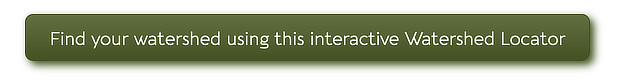
Examples of Buttons
Button Style
The default style of a button is as follows:
The initial style of buttons is determined by the settings located at Customize > General > Buttons. The default text color of the button is white for darker accent colors and black for lighter colors. The font family for the button text is derived from the font family specified for the <body> tag.
Click Action: Link or Lightbox
You can configure the button to perform either a link action or a lightbox action.
Set the Click Action to a Link
When selecting the "Link" click action, a Link section will become accessible.
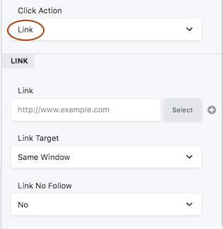
- Specify the URL to which the link should direct users, or use the "Select" option to choose a page or post from your site.
- Set the Link Target to determine whether the linked page replaces the current page within the same tab ("Same Window") or opens in a new tab ("New Window").
- The "Link No Follow" field informs search engines whether to follow the link or not. The default value is "No," indicating that search engines should follow the link. Choosing "Yes" indicates that search engines should not follow the link. For additional information on when to use the "nofollow" attribute, refer to the Google webmaster article.
Setting the Click Action to a Lightbox
If you opt for the "Lightbox" option, you will then choose between displaying custom HTML content or playing a video from a provided URL. Details regarding each option are described in the following sections.
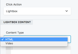
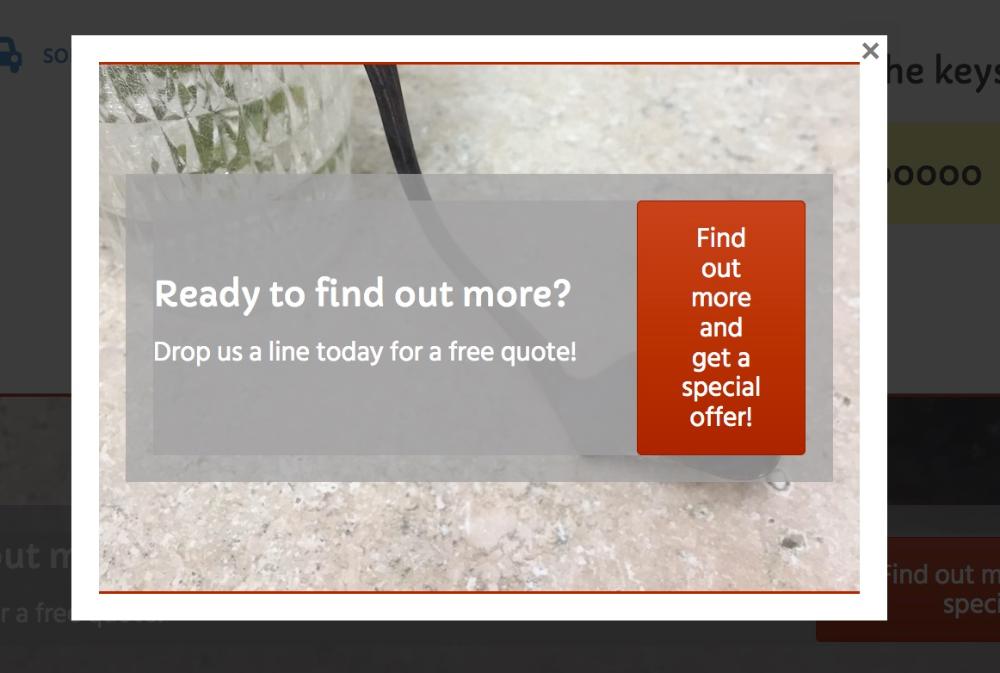
HTML Content
When selecting the HTML option, an HTML editing box will appear, allowing you to enter custom code such as HTML markup, video embed code, or shortcodes. In the example screenshot below, a shortcode for a saved row containing a Call to Action module was inserted into the HTML box to create an opt-in popup.
Additional shortcode examples include:
- Embedding an audio player using audio shortcodes.
- Utilizing shortcodes from a plugin to display the contents of a PDF file.
Video Link
If you choose the "Video" option, you will need to insert the URL of the video you wish to play within the lightbox. The URL can be obtained from services such as YouTube or Vimeo.
Button Settings
General Tab
The General tab consists of the following settings:
- Text - This field allows you to specify the text that will appear on the button.
- Icon - An optional icon that can be displayed alongside the button. If an icon is selected, two additional fields become available:
- Icon Position: Choose whether the icon should appear before or after the button text.
- Icon Visibility: Determine whether the icon should be visible at all times or only upon hover.
Click Action
Choose between "Link" or "Lightbox."
- If "Link" is selected, a Link field will open, allowing you to enter a typical URL link to another page or location.
- If "Lightbox" is chosen, a Content Type option will be presented, enabling you to select either HTML or Video.
- For HTML, you can add any code that should be displayed within the lightbox.
- For Video, a field will appear where you can provide the URL of a video from services such as YouTube or Vimeo.
Style Tab
The Style tab, as shown in the screenshot, provides various customization options for the button module. It is described below:
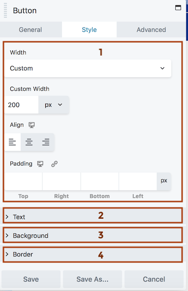
- Top Section
- Width: Choose from the following options:
- Auto Width: The width adjusts dynamically to fit the text and icon.
- Full Width: The width expands to the content area, excluding the module's margin settings.
- Custom: Set a specific width in pixels (px), viewport width (vw), or percentage (%).
- Align (responsive): Refer to the linked article for an explanation of how the alignment toggle settings work.
- Padding (responsive): Specify a specific padding value in pixels. Clicking the Link icon will automatically apply the same padding value to all four sides.
- Text Section
- Text Color: Set the color of the button text in its resting state.
- Text Hover Color: Define the button color when hovered over. If left blank, the Text Color setting will be used for hover as well.
- Typography Section: Please refer to the linked article for more information on the Typography section settings.
- Background Section
- Background Color: Choose the fill color for the button in its resting state.
- Background Hover Color: Set the fill color of the button when hovered over. If left blank, the Background Color setting will be used for hover as well.Background Style:
- Flat: Apply a consistent fill color to the background.
- Gradient: Utilize a gradient effect for the background color, with lighter shades at the top and darker shades at the bottom.
- Background Animation: By default, it is disabled. Enabling it will introduce a linear transition effect lasting 0.2 seconds from the resting state to the hover state.
- Border Section: For more detailed information on the settings within the Border section, please refer to the linked article.