Slideshow
Uses of this module
Use a slideshow module when you want to display a set of images in the foreground, one at a time. Besides the traditional horizontal slide transition, there are a number of other types of transitions from one image to the next, as described in the Playback tab section below. The images come from a gallery you create either in the bio Media Library. You can display the image title, but if there is other content you want to display and the image is of secondary importance, see the related modules described below.
Display options
Besides various types of transitions of the slides themselves, there are various options to display navigation and play controls, an image caption, social media links, thumbnails of the gallery, and a fullscreen toggle, all described in the following sections.
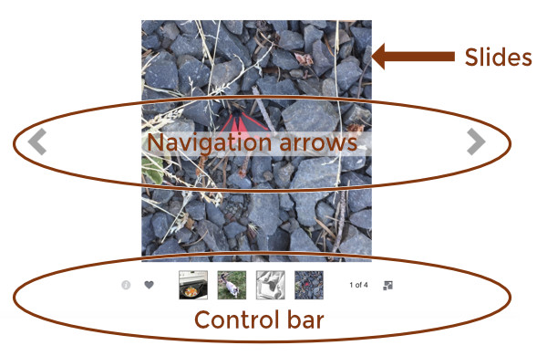
Here's a screenshot of an image slideshow, showing the three main areas:
- The slides are taken from a gallery of images that you specify.
- Large navigation arrows can be displayed on either side of the slides, or with wider slides the icons are overlaid on the slides.
- The control bar appears above or below the images, depending on your settings.All of the icons that appear in the control bar can be displayed or hidden, as explained in more detail below.
Figure 1: Slideshow module, annotated
Slideshow module settings
General tab
This tab has the following settings.
- Source
bio Media Library
- Photos (bio Media Library only) Contains links to create a gallery of images in your Media Library or to edit an existing gallery.
Display section
- Height
Sets the height of the box in which images and controls are displayed. The default height is 500px.
- Skin color
There's not much difference, but choose Light if you have light-colored images and background and Dark if you have dark-colored images and backgroiund. Individual image size is adjusted to maintain this height.
- Crop
Since the Height setting keeps the height of each image constant, the Crop setting determines whether the width of the image will adjust to display the full image (so width will vary depending on each image) or the image width expands to the full width of the column (minus margin and padding) and crops the left and right edges if necessary.
- Disable right-click
Does not allow image to be downloaded.
Click Action section
- Type
None, or choose Link to add a URL that will serve as a single destination for the entire set of images. You can't set a separate link for each image.
- Link URL
If you selected Link for the Click action, enter the destination URL here.
Playback tab
- Auto Play
Yes (the default) means the images transition automatically and can be overridden by any navigation controls that are displayed. No means the user must advance the images using the navigation controls.
- Speed
Number of seconds the full image is displayed. The default is 3 seconds.
Transition
Choose among the following types of transitions from one image to the next. The default transition is Fade.
- None
The next image is immediately displayed instead of a transition effect.
- Fade
Slide loses opacity while the next slide comes into view.
- Ken Burns
The Ken Burns movement is applied during both the display and transition times with a quick fade transition to the next slide.
- Slide horizontal
Typical horizontal movement from right to left
- Slide vertical
Current slide moves upwards followed by next slide. There is no white space between the current and next slide.
- Blinds
Vertical bands of white space appear over the image and become narrower until the full image is displayed.
- Bars
The next image appears with an overlay of nearly transparent gray squares during a fade transition..The effect works best at short transition times. For longer transitions the effect more resembles the Fade transition.
- Random bars
Vertical light gray bars of random width and spacing overlay the next image and fade out.
- Boxes
The next image appears with an overlay of nearly transparent gray squares during a fade transition.
- Random boxes
Random gray rectangles overlay the next image and fade out.
- Boxes grow
The next image appears with a gray grid overlay that shrinks and disappears.
- None
- Transition speed
Number of seconds spent transitioning to the next image. The default transition speed is one second.
- Randomize photos
No (default) means photos are displayed in the same order as they appear in the gallery. Yes means the images are randomized. The randomization order stays the same with autoplay loops and navigation.
Controls tab
This tab lets you select which controls you want to display.
The following figure shows the control icons in the control bar that you can see in the bio editor, with the icon labels underneath the figure. Any of the icons can be displayed or hidden.
Figure 2: Control bar icons displayed
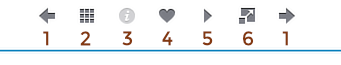
1 Navigation arrows 2 Thumbs button 3 Caption button 4 Fullscreen button 5 Social button 6 Play button 7 (shown in the front end but not in the Beaver Builder editor preview: Photo count control)
There are six sections on this tab: an unnamed top section, Control bar, Control bar buttons, Control bar overlay, Thumbs, and Social.
Unnamed top section
- Navigation arrowsChoose whether or not to display larger arrows that appear on each side of the slides, shown in Figure 1. If the image is wide enough, they are overlaid on the image.The actual color of the arrows depends on whether you set Light or Dark as the Skin color on the General tab. These arrows may appear inside or outside of the image, depending on image width and the Crop setting on the General tab.
NOTE: The navigation arrows in the control bar are controlled in the Control bar section.
Control Bar section
This section lets you choose the type of control bar and where to display it.
- Nav type
- If you don't want to display any control bar, choose None.If set to None, then the other Controls tab sections described below are hidden.
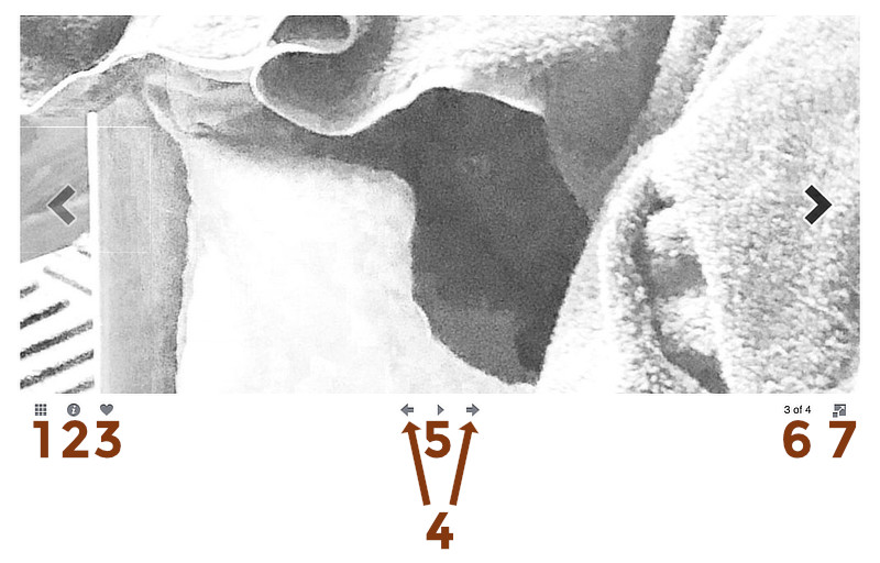
- The Buttons choice displays the control bar in the layout shown in Figure 3, depending on the control buttons selected for display.
Figure 3: Control bar Buttons layout displayed in the front end
-
- 1 Thumbs button 2 Caption button 3 Social button 4 Navigation arrows 5 Play button 6 Photo count 7 Fullscreen button
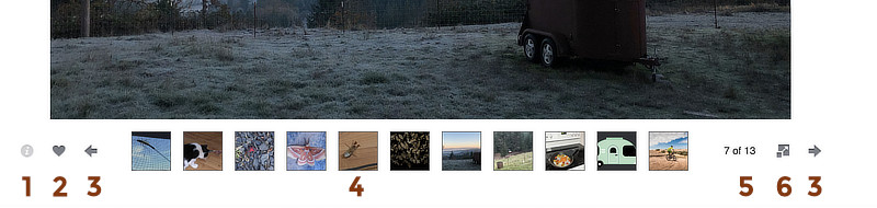
- The Thumbs choice displays thumbnails of the gallery images, which can be clicked to navigate to a different slide.By default, the size of the thumbnail images is 50px, but you can change that in the Thumbs size field in the Thumbs section.
Figure 4: Control bar Thumbs layout displayed in the front end
-
- 1 Caption button 2 Social button 3 Navigation arrows (do not appear unless there are two many thumbnail images to display in the width available) 4 Thumbnail images5 Photo count6 Fullscreen button
- Nav position
By default, the control bar is displayed below the slides. To move it above the slides, set it to Top.
Tip: You can also display the control bar in an overly at the top or bottom of the slide.
Control Bar Buttons section
You can show or hide any of the icons in the control bar. See Figures 3 and 4 for identification of the button icons.
- Navigation arrows (only visible when NavType is set to Buttons) Yes provides the ability to move the slides forward and backward manually.
- Play buttonYes provides the ability to begin automated playback of the slider.Note: The Play/Pause icon is only visible in the control bar when it is set to Yes and the Nav Style setting in the Control Bar section is Buttons.
- Fullscreen buttonIf set to Yes, this button is displayed and the slideshow expands to fullscreen when clicked.
- Photo count buttonIf set to Yes, the photo count is displayed as current photo position / total photos.
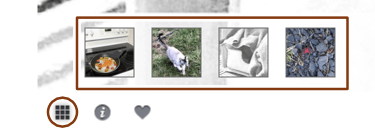
- Thumbs button (only visible when NavType is set to Buttons)Yes displays this icon, and clicking the icon opens thumbnails of all the images in the gallery, as shown in this screenshot. By default, the size of the thumbnail images is a square 50px, but you can change that in the Thumbs size field in the Thumbs section.
Figure 5: Control bar Buttons layout when Thumbs button is clicked
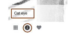
- Caption button - Yes displays the Information icon, shown in this screenshot, and clicking the icon displays the image's caption from the Media Library in an overlay over the slide.
Figure 6: Control bar when Caption button is clicked
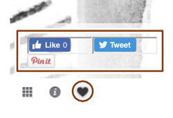
- Social button - Yes displays a Heart icon, shown in this screenshot, and clicking the icon displays whatever social buttons you have enabled in the Social section on this tab.
Figure 7: Control bar Buttons layout when Social button is clicked
Control Bar Overlay section
This section has an Overlay enabled field, which by default is set to No, meaning the control bar is displayed below or above the slides. If set to Yes, the control bar is placed in a narrow semitransparent band along the bottom or top of the slides themselves. In this case, there are two additional settings: Overlay Hide and Overlay Hide Delay. If set to No, the control bar overlay is always visible. If set to Yes, the control bar overlay disappears after the number of seconds that you specify.
Thumbs section
- Thumbs sizeSets the size of the thumbnails in pixels. The thumbnails are cropped squares, both in Buttons and Thumbs control bar layouts.
Social section
This section only appears when Social button is set to Yes in the Control bar buttons section. It controls which social icons appear when the Social icon is clicked.
The choices:
- Facebook button
- Twitter button
- Pinterest button
Advanced tab
There are all the usual Advanced tab settings for margins, visibility, animations, and advanced HTML settings.